Andrew Vande Moere is a senior lecturer affiliated with KULeuven, Belgium, and the University of Sydney, Australia. His research interests include data visualization, interaction design, media architecture and physical computing. Andrew is also the sole author of the "information aesthetics" weblog, a website collecting compelling representations of information that are engaging as well as insightful.
information aesthetics - Information Visualization & Visual Communication
Look at: http://www.benfry.com/
Review of speech:
Al Gore, climatic change (watch 8:55 h)
Web2DNA
Grafic web2dna.png
WEB2DNA will take you website, analyze it, crunch it to little bits and spit it out as a graphic representation of a human DNA.
The brightness of the lines is determined by the importance of the tags in terms of structure.
- H1 is brighter than H2, which is brighter than H3.
- TABLE is brighter than TR, which is brighter than TD tags.
- Images and flash elements appear as 70% white.
- New HTML tags like STRONG and EM is brighter than older ones like B and I
- UL, OL and DL is brighter than their LI, DT, DD
- DIV layout is brighter than table layout
http://www.baekdal.com/web2dna/
Visualisation: Rice population demographics
1 corn of rice = 1 victim of war
a physical visualization of the world population demographics, by mapping 1 grain of rice to represent 1 human being. in the "of all the people in all the world" installation, population statistics are separated out in different piles to juxtapose compelling social phenomena, such as the comparison of all the prisoners in the world versus all the people in gated communities (roughly equal).
Installation: news casualties as candy
An art installation that represent the casualties in news reports as an ever-increasing random constellation of bright yellow candy. a computer program continuously scans the headlines of 4,500 English-language news sources around the world, looking for people who have been reported killed. the algorithm determines the number of deaths, & instructs a specially designed ceiling-mounted mechanism built with Lego NXT parts to drop one yellow BB per person. as a result, BBs will accumulate on the floor, ultimately forming a sort of aesthetic monument.
http://caleblarsen.com
Make data visible: power-aware cord
Bild: http://infosthetics.com/archives/powerawarecord.jpg
An electrical cord that acts as an ambient display, as the amount of energy is displayed through dynamic glowing patterns produced by electroluminescent wires molded into its transparent shell. this cord attempts to increase consumer awareness regarding energy consumption, by a new intuitive way of representing energy in domestic, electric products. also see dangling string. [tii.se]
Twitter Earings? Image?
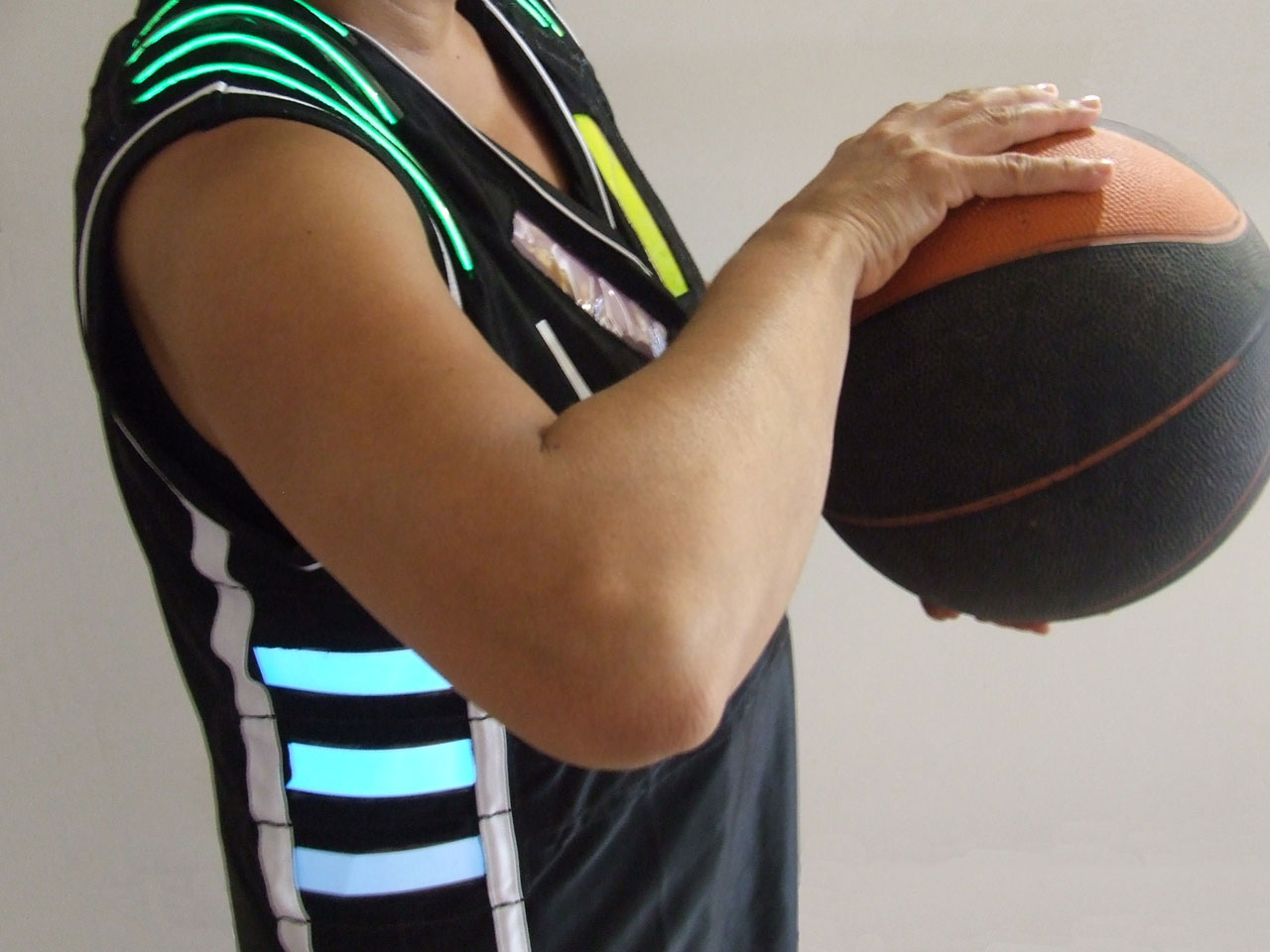
Data visual sports jersey:
we recently designed & implemented a set of 4 electronically-enhanced basketball jerseys with different EL-panels that light up according to game-related data, such as fouls, score, time clock, etc. the jerseys are wirelessly controlled from a central computer by a game official in real time.
the TeamAwear system aims to actively enhance the awareness & understanding of the actual team sport situation for its different stakeholders, including athletes, referees, coaches & spectators.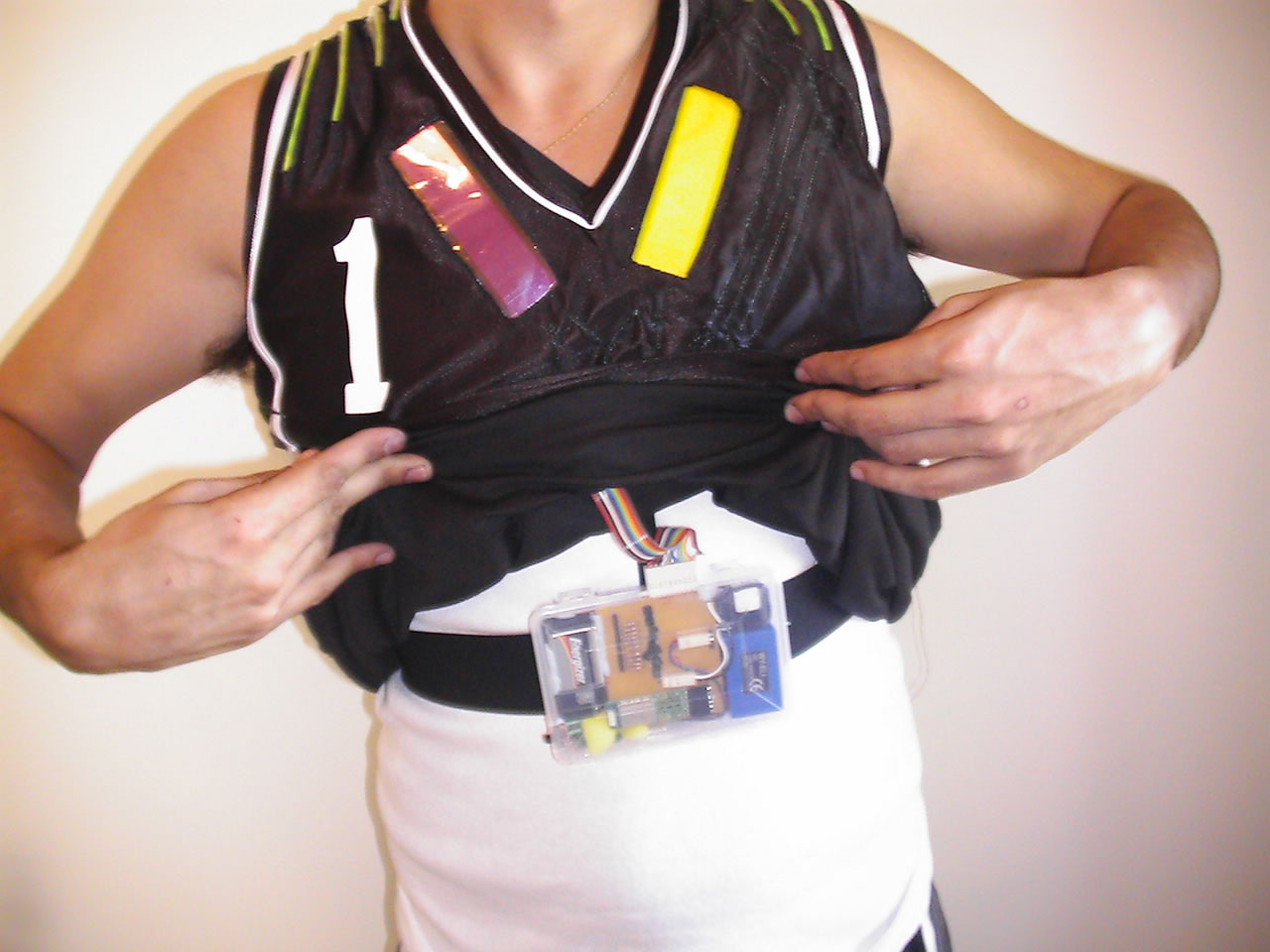
Links:
- http://www.mitchellpage.com.au/teamawear/index.html
- http://www.smh.com.au/news/technology/technology-gets-a-guernsey/2006/11/20/1163871338586.html?page=fullpage#contentSwap1
- http://wwwfaculty.arch.usyd.edu.au/kcdc/
An impressive online sharing project, developed by the renown IBM Visual Communication Lab, to encourage sharing & conversation around visualizations. the goal of "Many Eyes", which is still in 'alpha phase', is to "democratize visualization, enabling anyone on the Internet to publish powerful interactive visualizations & start their own data conversations."
http://manyeyes.alphaworks.ibm.com/manyeyes/
City-scale energy consumptionFirst 30 seconds of Green Cloud goes online from HeHe on Vimeo.
An intriguing eco-visualization concept, originally blogged in April 2005, recently seems to have become reality. "Nuage Vert" ("Green Cloud") is a city-scale light installation representing the actual energy consumption (& its accompanying environmental pollution?) of a coal burning power plant.
More: http://www.pixelache.ac/nuage-blog/
Sensing City Amsterdam, Persuasive Data Visualisation
A city has its own rhythm that affects the life of its people and is at the same time created by them. Bus schedules, traffic lights and the turn signals of cars are familiar patterns to the citizen. This interplay between creation and inspiration is also at the heart of all music. Making music means translating impression into sound, listening to music means transforming sound into impression.
So what happens if we allow these urban rhythms to occasionally have a direct influence on the musical performance of an eleven-piece-ensemble?
As the movement of cars outside the concert venue triggers the rhythms that are being played, the urban dwellers not knowingly become part of the composition, the city becomes audible through the musicians. This process happens in real-time and is guided by the framework of a video-installation that surrounds the ensemble during the performance of sensing city.Sensing City Preview from LevenMusterCollective on Vimeo.
#Sonification

Keine Kommentare:
Kommentar veröffentlichen