Posts mit dem Label Large Information Display werden angezeigt. Alle Posts anzeigen
Posts mit dem Label Large Information Display werden angezeigt. Alle Posts anzeigen
Donnerstag, 22. März 2012

Montag, 3. Januar 2011
The Dow Piano
The daily trading of the Dow Jones industrial average determines the songwriting here, translating the ups and downs of 2010’s market into musical notes. Using a five-note scale spanning three octaves, pitch is determined by each day’s closing level.
The Dow Piano - CNNMoney.com
Donnerstag, 16. September 2010
Data Sculpture

My work focuses on the intersection of art and science and the visual articulation of scientific observations. Using the methodologies and processes of both disciplines, I translate scientific data related to astronomy, ecology and meteorology woven sculptures. My method of translation is principally that of weaving – in particular basket weaving – as it provides me with a simple yet highly effective grid through which to interpret data in three-dimensional space. By staying true to the numbers, these woven pieces tread an uneasy divide between functioning both as sculptures in space as well as instruments that could be used in the actual environment from which the data originates.
Nathalie Miebach: sculpture
Mittwoch, 11. August 2010
The Four Seasons Visualized
The Four Seasons Visualized on Datavisualization.ch: "Recently I’ve spotted a beautifully designed study of The Four Seasons by Antonio Vivaldi. It’s the work by Laia Clos’ studio mot.
lesquatrestacions is a graphic information system for visualizing the lead violin of Vivaldi’s masterpiece. The work consists of four posters, a set of stamps and the documentation of the system."
lesquatrestacions is a graphic information system for visualizing the lead violin of Vivaldi’s masterpiece. The work consists of four posters, a set of stamps and the documentation of the system."
Mittwoch, 28. Juli 2010
Grooveshark Mobile Music
Grooveshark Mobile Music: Available Phones: "You already do everything on your phone—now make it even more personal. Choose the phone you use, then choose from millions of songs to play instantly. Yeah, there's an app for that."
Donnerstag, 11. März 2010
Dienstag, 13. Oktober 2009
The Stock Ticker as a Planetary System
"STOC is a data visualization of the S&P 500 from the NYSE programmed in Processing. Each circle in the visualization represents one of the stocks in the S&P, with characteristics of each visualizing different data points for each. There is a legend in the project that will explain the relationships between data and visuals, as well as a list of the controls for interactivity. In the very near future we will be posting a tutorial video as well as the podcast ACM recorded of my Siggraph presentation. The project currently runs between 20 and 30 minutes behind real time and locks up momentarily when it updates every 10 minutes, which we are working on fixing asap. The project requires an internet connection, but I am unsure of other system requirements. We will be optimizing newer versions, and I will be making a mailing list of everyone that contacts me to announce updates."
UNIFORM CHAOS / Experimental Art Graphic Design / Stoc:
Mittwoch, 9. September 2009
Where did all the money go?

Stamen Design, in its most recent project with the State of California, lets you explore the money breakdown. Like most of Stamen's work, at the base is an interactive map, but it is of course much more than that.
California Economic Recovery Portal - Stimulus Map:
"American Recovery and Reinvestment Act (Recovery Act) funding is disseminated by the federal government directly to various entities within a state including state government entities, local government entities, local businesses, local non-profits and other organizations. Under 50 percent of Recovery funding is estimated to flow through state government entities."
Donnerstag, 3. September 2009
Flare | Data Visualization for the Web
Flare | Data Visualization for the Web: "Flare is an ActionScript library for creating visualizations that run in the Adobe Flash Player. From basic charts and graphs to complex interactive graphics, the toolkit supports data management, visual encoding, animation, and interaction techniques. Even better, flare features a modular design that lets developers create customized visualization techniques without having to reinvent the wheel."
Donnerstag, 20. August 2009
Mittwoch, 8. Juli 2009
Mittwoch, 17. Juni 2009
Mobile screen sizes

Pixel dimensions and aspect ratios

Physical screen size

Read more:
- Mobile screen size trends
- More on mobile screen size trends
Sonntag, 12. April 2009
Winner of the Personal Visualization Project is… | FlowingData
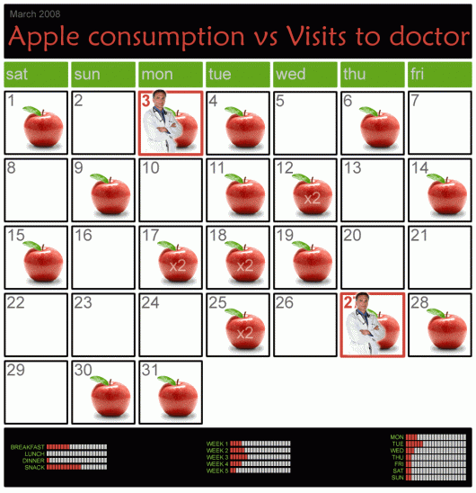
Winner of the Personal Visualization Project is… | FlowingData:
"While I enjoyed all the entries (and I hope you all enjoyed making them), there can only be one winner. The winner is Tim Graham who took manual personal data collection to another level. From email spam, to beverage consumption, to aches and pains, Tim embraced the spirit of self-surveillance. He even made his personal data available in the forums. Congratulations, Tim!"
Donnerstag, 2. April 2009
Mittwoch, 4. März 2009
NYTimes: A Visual Yearly Overview of News (1984-2009) - information aesthetics
NYTimes: A Visual Yearly Overview of News (1984-2009) - information aesthetics:


A series of visualizations [flickr.com] that represent the top organizations and people mentioned in the news articles of the New York Times for a given year of news between 1984 and 2009. Connections between these entities are drawn, so that relationships can be found and followed. These circular graphs are based on the faceted searching abilities of the NYTimes Article Search API, that were released a short while ago.
More information on the blog entry of the author, Jer Thorp.
Reminds me of the circular graph of the Eigenfactor project, although some subtle differences in "bundling" the edges for visual clarity exist.
Via datavisualization.ch.
Dienstag, 3. März 2009
see conference #4
see conference #4 - Die Konferenz zur Visualisierung von Information am 18.4.2009 in Wiesbaden. Präsentiert von Scholz & Volkmer
Speakers:
- Aaron Koblin, Google Creative Lab, San Francisco
-Sebastian Oschatz, MESO Digital Interiors, Frankfurt
- Gijs Joosen, ONL, Rotterdam (Architecture = Information)
- Julian Oliver, Software Künstler, Madrid (Augmented Reality)
- Eric Rodenbeck, Stamen Design, San Francisco (Mapping)
- Prof. Dr. Dr. Gerhard Roth, Universität Bremen
Speakers:
- Aaron Koblin, Google Creative Lab, San Francisco
-Sebastian Oschatz, MESO Digital Interiors, Frankfurt
- Gijs Joosen, ONL, Rotterdam (Architecture = Information)
- Julian Oliver, Software Künstler, Madrid (Augmented Reality)
- Eric Rodenbeck, Stamen Design, San Francisco (Mapping)
- Prof. Dr. Dr. Gerhard Roth, Universität Bremen
Montag, 16. Februar 2009
Gridplane

I collaborated with Instrument to develop a series of data visualization concepts for Google. These interface sketches are are all based around a concept of aggregating and visualizing online media buzz across various social media outlets.
Working in tandem with Google Analytics, the Flash-based, interactive tools allow users to explore relationships and see the effects of blogs, as well as mainstream and social media over time.
Gridplane
Dienstag, 10. Februar 2009
LastGraph: About Posters

LastGraph is an online application that takes data from Last.fm and turns it into a series of lovely graphs.
It uses Graphication for the graph rendering, and Django for the web frontend. You can see it in action, and read more about it, at lastgraph3.aeracode.org.
More Project of Andrew godwin can be found here.
Montag, 2. Februar 2009

Abonnieren
Posts (Atom)


