Posts mit dem Label see conference #4 werden angezeigt. Alle Posts anzeigen

Donnerstag, 15. April 2010

THE JOHNNY CASH PROJECT

The Johnny Cash Project is a global collective art project, and we would love for you to participate. Through this website, we invite you to share your vision of Johnny Cash, as he lives on in your mind’s eye. Working with a single image as a template, and using a custom drawing tool, you’ll create a unique and personal portrait of Johnny. Your work will then be combined with art from participants around the world, and integrated into a collective whole: a music video for "Ain’t No Grave", rising from a sea of one-of-a-kind portraits.

THE JOHNNY CASH PROJECT

Montag, 15. März 2010

Dienstag, 21. April 2009

see #4 | Additional links: Aaron Koblin

Aaron Koblin's personal page.

Flight pattern
The Flight Patterns visualizations are the result of experiments leading to the project Celestial Mechanics by Scott Hessels and Gabriel Dunne. FAA data was parsed and plotted using the Processing programming environment. The frames were composited with Adobe After Effects and/or Maya.


Bicycle Built for Two Thousand
2.088 voice recordings collected from online workers assembled into the song "Daisy Bell" - the first example of computer synthesized vocals. Each individual was prompted to listen to a short sound clip, then record themselves imitating what they heard without knowledge of the final task. A collaboration with Daniel Massey.


House of Cards
Lasers and sensors are used to scan the band Radiohead into a three-dimensional particle-driven data experience. The code and data are launched on Google Code as an open source "music video without video" project.


New York Talk Exchange
Visualizations for the New York Talk Exchange, a project by the Senseable City Lab at MIT for the MoMA.
New York Talk Exchange illustrates the global exchange of information in real time by visualizing volumes of AT&T long distance telephone and IP (Internet Protocol) data flowing between New York and cities around the world.


More projects can be found at his portfolio.

see #4 | Additional links: Sebastian Oschatz


- George Michael Live25 Visuals
- MESO - EnBW EnergyGlobe
- Data Exploration Table for CDW
- BASF World Globe

More projects can be viewed on www.meso.net.

see #4 | Additional links: Julian Oliver

Historic and recent maps:
Missing data from Bagdad on google-maps:

Größere Kartenansicht


Packet Garden
Create places from peoples data - email, im, images visualized as packets.

PacketGarden Demo from Julian Oliver on Vimeo.


Augmented Reality
- History: Projected ghost
- Optical illusions

Level Head
levelHead uses a hand-held solid-plastic cube as its only interface. On-screen it appears each face of the cube contains a little room, each of which are logically connected by doors.


The artvertiser
The Artvertiser is an urban, hand-held, augmented-reality project exploring on-site substitution of advertising content for the purposes of exhibiting art. The project was initiated by Julian Oliver in February 2008 and is being developed in collaboration with artists Clara Boj and Diego Diaz.

Augmenting a Postcard from Julian Oliver on Vimeo.

see #4 | Additional links: Eric Rodenbeck

From Eric Rodenbeck, stamen design:

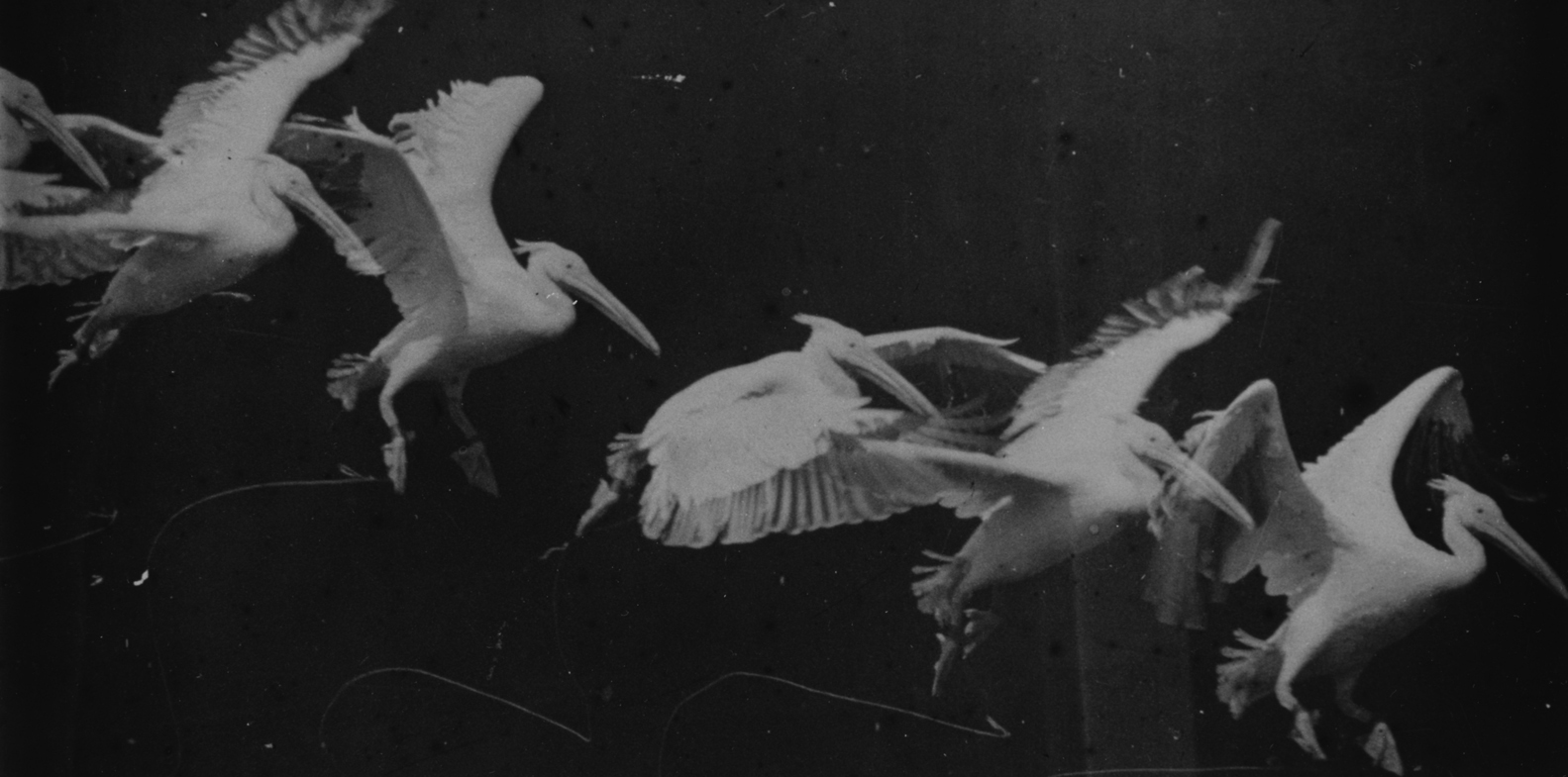
First time of Datavisualisation
Bird Flight by Etiene Jules Marey, 1882


Data information projects:
The 1k Project


The 1k Project II


Cloudmade
CloudMade help you make the most of map data. We source our maps from OpenStreetMap, the community mapping project which is making a free map of the world. Our aims are to continue the democratization of geo data and to expand access to open geo data through a range of simple yet powerful tools and APIs.
Cloudmade - Customade Maps


Cabspotting
Cabspotting traces San Francisco's taxi cabs as they travel throughout the Bay Area. The patterns traced by each cab create a living and always-changing map of city life. This map hints at economic, social, and cultural trends that are otherwise invisible. The Exploratorium has invited artists and researchers to use this information to reveal these "Invisible Dynamics."
www.cabspotting.org/


Digg Labs
The labs provide a broader (and deeper) view of Digg. A lot of stuff gets submitted to Digg every day, so good things can sometimes fly right past you. Labs projects look beneath the surface of the Digg community's activities.
Labs projects are the results of collaboration with Digg partner stamen design. We've also released a public API for Digg so that anyone can turn Digg data into their own visualizations.
http://labs.digg.com/


SFMOMA Artscope
The SFMOMA Artscope is a visual browsing tool that allows to explore more than 3500 artworks in the collection.
http://www.sfmoma.org/projects/artscope/


LOCOG
A new map for LOCOG (the London Organising Committee of the Olympic Games). The project organizes of the thousands of geocoded articles and photos that the London 2012 team are producing, highlight the ongoing works in the Olympic Park, London and the UK, and showcases the depth and breadth of information available on the main site.
http://london2012.com/


Oakland Crimespotting
Oakland Crimespotting is an interactive map of crimes in Oakland and a tool for understanding crime in cities.
If you hear sirens in your neighborhood, you should know why. Crimespotting makes this possible with interactive maps, e-mail updates, and RSS feeds of crimes in areas that you care about.
We’ve found ourselves frustrated by the proprietary systems and long disclaimers that ultimately limit information available to the public. As citizens we have a right to public information. A clear understanding of our environment is essential to an informed citizenry.
http://Crimespotting.org


Many Eyes
Many Eyes is an “open laboratory” for exploring the intersection of data visualization and user generated content. The folks at CUE have made available an application (or set of applications) which create on-the-fly visualizations of data sets that users of the site can upload. On the site’s about page, the group states its objective as the enabling of “a new social kind of data analysis.”
http://manyeyes.alphaworks.ibm.com


More Links & Projects:
Jason Salavon
The Stamen Design-Blog

see #4 | Additional links: Prof. Dr. Dr. Gerhardt Roth

Prof. Dr. Dr. Gerhardt Roth on Wikipedia (german).

Visuelle Wahrnehmung

see conference #4 - summary


On April 18th we visited the see conference #4 in Wiesbaden, a get together of all kind of information-design interested people, organized by the design agency Scholz & Volkmer.
At 10am the doors were opened and an hour later Michael Volkmer welcomed the audience to the fourth edition of the event.

He briefly inducted the audience into the idea behind the conference as a platform of reflection on a topic that he defines as the gain of knowledge through the aggregation of images. Also he pointed up the importance of visualiziation of data in world of continously increasing complexity.

Using the example of a poster on «Virtual Water» done at the University of Applied Sciences Potsdam, Germany in 2007 he emphasized the power of visual formulations to reveal hidden processes and to help understanding them. He noted that even it's too wide a subject to outline the topic within the short time of a conference like the see, they each time anew try to present at least the more experimental approaches to handling information visually.


Prof. Dr. Dr. Gerhard Roth

Every see conference starts with a kind of keynote. This time it was given by Prof. Dr. Dr. Gerhard Roth of the University of Bremen. His lecture was titled «Outer World, Inner Images» and focused on the way visual perception works and how our brain combines visual impression with saved information taken from our memory to speed up the classification of the seen image.


A very interesting journey through human brain which bit by bit discloses its secrets of perception mechanisms to science. At last all scientific examination still fails on answering the final question for the who – the one who's actually experiencing any sensation.


Eric Rodenbeck


Eric Rodenbeck of San Francisco-based Stamen Design followed. He held his lecture on «Abundant Screens Reaching Through Maps and Live Visualization». In some selected examples he demonstrated how his team experimented with gathering information in urban areas and visualizing them in the form of projections onto maps. A more ironic example like the one above that shows the geographical accumulation of women in Manhattan who make more than $ 100.000 points out the problem of information overlays hiding the map's geographic data.

Another interesting aspect of those visualizations was the side effect that technical errors thereselves sometimes lead to new conclusions. In the example shown above the recorded GPS signals of cabs were reflected by the higher buildings at some sites in San Francisco. In these areas the delivered position information was very imprecise. Instead of showing the exact course of the roads clouds of dots appear in the visualization. This inexactness as a visual statement suggests a local change of cityscape in these areas.

Eric's company Stamen also works in context of the Olympics 2012 in London. They did a map solution to provide an overview of the different venues. But as these sport facilities are still under construction and continuously changing the team couldn't just fall back on data offered by services like Google Maps. So they combined the given data in the form of abstract map information with a concrete image layer of continually updated satellite pictures. So the progress at the construction sites can successively be tracked.


Julian Oliver


Madrid-based software artist, inventor, teacher and occasional writer Julian Oliver also came up with several of his latest projects. One of these is Packet Garden.

It's a visualization tool that shows the origin and type of network data packets sent and received by the computer the software is run on. On a globe the origins of the packets are displayed. Downloads result in little valleys, uploads form mountains. The packets themselves are visualized by plants which grow with the amount of data traffic. The plants vary depending on the type of application they were induced by. So the users
… can grow a unique garden world as a graph of their daily network traffic.
I found this nice Packet Garden demo video on vimeo:


Another field of activity of Julian is so-called augmented reality – the computer-based expansion of our perception of reality. The most approaches work with markers which are placed in the real world. A camera captures a real-time video stream of the marked space and a software uses the markers to align virtual 3d data to the video image. Finally the virtual objects seem to be placed right into the real world. Julian experimented a lot with these techniques and developed an augmented reality game named LevelHead in 2006. It's based on three cubes a walking man is to be led through by turning the cubes in front of a camera as it can be watched in the video below.


Of course using markers isn't the most favorable solution to make the computer familiar with the space in front of his mechanical eye. Currently Julian is testing a method that uses a laser to gather 3d information of a room by capturing spots in space and calculating the change of perspective from the changes of distances and positions of the spots in relation to a sensor. The very impressive video on the laser tracking technology Julian screened during his talk can be watched here.


Gijs Joosen


Many of the guys who were speaking at the see #4 told they had been thinking about studying architecture at least once in their early years. But Gijs Joosen was the only real architect on board. It was no suprise that he mainly talked about the design processes behind the last projects of his studio ONL.

It's obvious that visualization is an important aspect of an architect's work to communicate his ideas and to have three-dimensional visual data to reflect on design decisions. Gijs demonstrated how particular design challenges were solved by using special software to work on the concepts directly in their visual depiction.


Sebastian Oschatz

Sebastian Oschatz works for MESO, a design team for digital media and media systems based in Frankfurt am Main, Germany and holds several teaching assignments at German universities.

He presented some impressions of MESO projects like the one they did for the German chemical company BASF. For an internal congress they installed a big globe in the entrance hall of the location where the event took place. By several video projectors the geographical information was displayed on the sphere. On top of it all current business activities of the company all over the world were marked.


The digital enviroments and media installations Sebastian and his colleagues created to make information and abstract data easily accessible and tangible were also very impressive. Finally he talked about the visual programming language vvvv and showed some examples to demonstrate how vvvv can be used to build and control massive media systems.


Aaron Koblin


As we believe in the sophisticated Google propaganda Aaron Koblin must have one of the greatest jobs possible. Imagine him as a boy of five years who was allowed to live in a toy store. Aaron works at the Google Creative Lab in San Francisco. So I honestly don't think he has to really care about the usual limitations of time or funding while he is experimenting with data and visualization techniques.


As the final speaker at the see #4 he talked about projects like the making of the great video for the song «House of Cards» by the band Radiohead we both admire. The video was done without any cameras. All images where created from 3d data captured by different laser scanners. The video and its making-of can be watched below.


He also came up with projects like the visualizations done for the New York Talk Exchange with the Senseable City Lab at the MIT. Another experiment that made me smile was the conversion of the viewer levels of different TV channels into audio data. The patterns vary depending on the type content shown on the particular channel. So a soap opera channel clearly differs in its sound from a news channel like CNN. I wonder what the sound waves displayed for Playboy TV (last line in the image below) do suggest!?

(Text & Images by Visual attitudes)

see conference #4

Eine Zusammenfassung der gelungenen Konferenz gibts bei: see conference #4 | Slanted - Typo Weblog und Magazin

Dienstag, 14. April 2009

See conference speakers: Sebastian Oschatz

MESO Digital Interiors GmbH, Frankfurt

- Video-Tracking Software, vvvv.org/tiki-index.php

Hochschulprojekt in Gruppenarbeit, Dozent: Sebastian Oschatz/ MESO
Keine Mäuse: Wie bekommt man elektronische Medien weg vom Bildschirm, weg vom Klickefinger und zurück auf den Boden und hinein in den Raum?
SCHALLPLATTEN ist ein Drum-Computer, der rein grafisch durch das Legen von Mustern funktioniert. An dem tischgroßen Instrument können spielerisch mittels Plastikplättchen gemeinsam Rhythmen gestaltet werden. Per Video-Tracking (VVVV) und MIDI werden die Sounds in Echtzeit angesteuert, abgespielt und je nach Lage der Plättchen verändert. Über eine installierte Polaroid Kamera können die gelegten Muster anaolg gespeichert und an der zweiten Station wieder aufgelegt, eingelesen und digital geremixt werden.
(Idee / Konzept / Ausführung / Design / Sounddesign / in Zusammenarbeit mit Sebastian Pforr, Jennifer Schaper und Jan Snippen / Mit Unterstützung von Sebastian Oschatz, MESO digital interior

See conference speakers: Gijs Joosen

ONL Rotterdam
Gijs Joosen vom holländischen Architekturbüro ONL (Oosterhuis_Lénárd) referiert zum Thema "Architecture = Information". Er wird Entwurfsmethoden zeigen, die auf Game Engines basieren. Und über Realtime-Datenerfassungstechniken sprechen, die es Gebäuden ermöglichen in Echtzeit auf Wünsche und Neigungen ihrer Nutzer zu reagieren.

See conference speakers: Julian Oliver

Software Künstler, Madrid

Level head


The Artvertiser

The Artvertiser: Augmented Billboards. from Julian Oliver on Vimeo.

See conference speakers: Eric Rodenbeck

Stamen Design, San Francisco


- http://labs.digg.com/, http://origin.arstechnica.com/journals/apple.media/DiggLabsArc.jpg
- http://labs.digg.com/swarm/, http://www.seomoz.org/user_files/2006/digg_swarm_screenshot3.jpg
- http://oakland.crimespotting.org, http://infosthetics.com/archives/oakland_crimespotting3.jpg
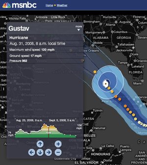
- Hurricane tracker, http://mike.teczno.com/img/hurricane-tracker.jpg

See conference speakers: Aaron Koblin

Google Creative Lab, San Francisco


- Ten Thousand Cents, http://www.ehrensenf.de/files/linktipps/TenThousandCents.jpg
- The Sheepmarket, http://www.onscreenmag.com/wp-content/uploads/2008/06/sheepmarket.jpg

- Radiohead - House of Cards
In Radiohead's new video for "House of Cards", no cameras or lights were used. Instead, 3D plotting technologies collected information about the shapes and relative distances of objects. The video was created entirely with visualizations of that data.

Dienstag, 3. März 2009

see conference #4

see conference #4 - Die Konferenz zur Visualisierung von Information am 18.4.2009 in Wiesbaden. Präsentiert von Scholz & Volkmer

Speakers:
- Aaron Koblin, Google Creative Lab, San Francisco
-Sebastian Oschatz, MESO Digital Interiors, Frankfurt
- Gijs Joosen, ONL, Rotterdam (Architecture = Information)
- Julian Oliver, Software Künstler, Madrid (Augmented Reality)
- Eric Rodenbeck, Stamen Design, San Francisco (Mapping)
- Prof. Dr. Dr. Gerhard Roth, Universität Bremen